PART A:
For this part of the project we need to Histogram-equalize the R, G, and B images separately using the histogram-equalization program and convert the image back to tif format. This is how the original image looks like:
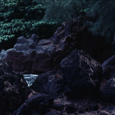
Here is what I got when I separated each channel from the original image. I basically separated by using the 'imwrite' function in octave and selected only 1 channel at a time. For example, when I wanted the 'red' channel or channel number 1 I would simply write in octave:
a=imread("darkstream.jpg");
b=double(a)/255;
imwrite("redstream.jpg", b(:,:,1));
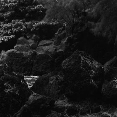
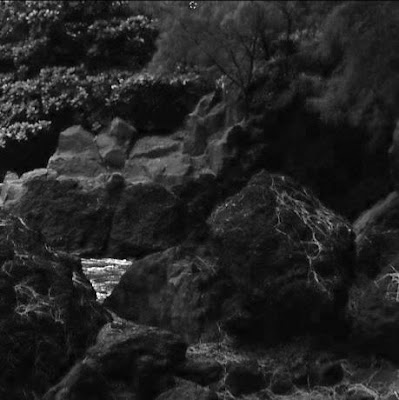
Here are the images I got for isolating for channel 1 to 3, respectively.
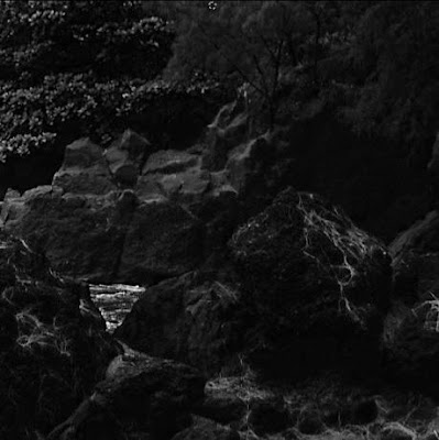
As you can observe, each channel whether it be the red,blue, or green channel, each has its own 'area' which it shows more detail than any other channel image. For example, if you look at the leaves/branches of the tree in the 'middle-right' of the original image, you will notice that the green and blue channels show more 'detail in this tree' than in say the red channel. Also, in the areas of the rocks where the 'red' is prominent, you can see these details even more through the 'red channel' image because since there is more of a red content here, all the 'reds' come out looking brighter in the 'gray' image which is made by isolating for the 'red-channel only'.
Next I need to normalize and equalize each of the images (red, green, blue) above, using octave. Here is the code I used to normalize and equalize the red channel.
A= imread("redstream.jpg");
size(A)
# normalize histogram
b=hist(A(:),256,1);
r = 0:255;
s = zeros(size(r));
for k = 1:256;
s(k) = round((2^8-1)*sum(b(1:k)));
end;
C= zeros(size(A));
for y = 1:460;
for x = 1:459;
C(y, x) = s(A(y, x)+1);
end;
end;
imwrite("redeq3.png", double(C)/255);
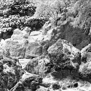
I then applied this same code to each of the images I got for each channel above. Here are the resulting images from red to blue, respectively.
Next, I need to combine each of these 3 equlized images together to make 1 'new' image.
To do this you need to write in octave:
a=imread("redeq3.png");
b=imread("greeneq3.png");
c=imread("blueeq3.png");
A(:,:,1)=a;
A(:,:,2)=b;
A(:,:,3)=c;
imwrite("finala.png", a,b,c);
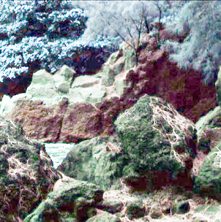
The resulting image looks like this:
* * * * * * * * * * * *
PART B:
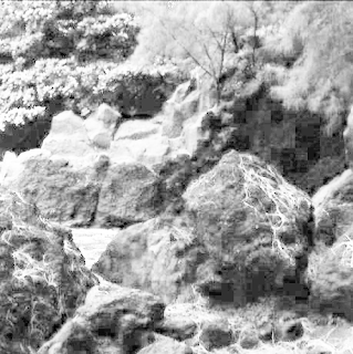
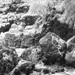
For this part of the project we need to Form an average histogram from the three histograms in (a) and use it as the basis to obtain a single histogram equalization intensity transformation function. Apply this function to the R, G, and B components individually, and convert the results to jpg. Compare and explain the differences in the tif images in (a) and (b).
First we need to find the average histogram of the original 3 histograms we got by isoloating for 1 of 3 channels for the original image called "darkstream.jpg".
To do this in octave we need to write:
R=imread(“redstream.jpg”);
G=imread(“greenstream.jpg”);
B=imread(“bluestream.jpg”);
# normalize each channel...
hr=hist(R(:),256,1);
hg=hist(G(:),256,1);
hb=hist(B(:),256,1);
# find the average by adding all together and then divide by 3...
havg=(hr+hg+hb)/3;
# histogram equalization of Red Channel (R)
r = 0:255;
s = zeros(size(r));
for k = 1:256;
s(k) = round((2^8-1)*sum(havg(1:k)));
end;
C= zeros(size(R));
for y = 1:460; %size of image 460 by 459 pixels
for x = 1:459;
C(y, x) = s(R(y, x)+1);
end;
end;
imwrite(“Bredeq.tif”,double(C)/255);
# histogram equalization of Green Channel (G)
r = 0:255;
s = zeros(size(r));
for k = 1:256;
s(k) = round((2^8-1)*sum(havg(1:k)));
end;
C= zeros(size(G));
for y = 1:460;
for x = 1:459;
C(y, x) = s(G(y, x)+1);
end;
end;
imwrite(“Bgreeneq.tif”,double(C)/255);
# histogram equalization of Blue Channel (B)
r = 0:255;
s = zeros(size(r));
for k = 1:256;
s(k) = round((2^8-1)*sum(havg(1:k)));
end;
C= zeros(size(B));
for y = 1:460;
for x = 1:459;
C(y, x) = s(B(y, x)+1);
end;
end;
imwrite(“Bblueeq.tif”,double(C)/255);
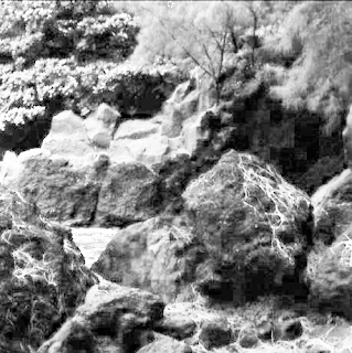
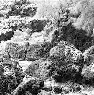
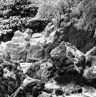
Here are the resulting 'equalized - average images' (note that I had to rename these images to 'png' files because the blog site could not post 'tif' images):
Finally, we need to combine all 3 of these equalized 'averaged' images into 1 image, much like how we did for part(A).
To do this we simply need to write the following in octave:
a=imread("Bredeq.tif");
b=imread("Bgreeneq.tif");
c=imread("Bblueeq.tif");
A(:,:,1)=a;
A(:,:,2)=b;
A(:,:,3)=c;
imwrite("finalb.tif", a,b,c);
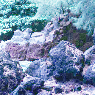
Here is the resulting image for part(B):
I will reproduce the 'final image' in Part(A) here so that we can more easily compare/contrast the final images in A and B.
COMPARISON:
The obvious difference between the two images streamA (part A image) and streamB (part B image) is that streamA looks more alive. What I mean to say is that the colours appear brighter and therefore provides detail which appears 'more full', when compared to streamB. In a way this makes sense as in streamA we are individually 'equalizing' each channel which would then similarly enhance or brighten each channel to its fullest. Whereas on the other hand, as in part B, we constructed streamB by equalizing an 'averaged' channel. Therefore, the resulting colours which come out from streamB are not as 'full' or bright.
Another difference which can be observed is that streamB looks 'grainier' than streamA. This is most evident if you look at the shaded rocks in streamB (towards the right). If you look right into this shaded region, you will see 'square pixelizations' taking place in this region. This can also be observed in streamA, however it is less evident.
Finally, in streamA you can observe that all the 'RGB' colours are enhanced or present. Whereas in the streamB image you can not see 'all' the colours present. It almost looks like one of the channels is missing or that we are looking at the 'streamA' image through a 'blue lens'. For example, if you look at the rocks in the foreground, you will see 'moss' in the streamA image but the moss does not 'pop' out in the streamB image. In a way this makes sense to me for if you look at the 2nd 'gray image' in partB (the green channel), you will notice that it is blurrier than the other 2 gray images produced. This leads me to believe that the 'greens' would get washed out when we 'combine' these 3 channels together to make a new 'streamB' image. Which of course is what we observed.
In conclusion, I believe that using the 'average' method to create the streamB image resulted in an image which is duller and shows less colours. If I was to enhance an image so that 'more colours' would be enhanced and amplified, I would equalize for each channel separately and then combine them to make a new and improved image.
Wednesday, July 16, 2008
Monday, July 7, 2008
Project #3 - unsharp masking...
For this assignment we needed to enhance the 'blurred' image of building_blur.tif.
Since this image was relatively large, and therefore would make octave run slowly, I reduced the image size to 300x287 and saved it as a png file.
I then used photoshop to sharpen the image using the filter/sharpen.../unsharp mask... tool; using Amount=291, Radius=2.3, and Threshold=0. If I made the radius any bigger, then some of the bricks would start to get very dark and the 'vertical' lines would get thicker and darker. If I increase the Threshold even slightly, then the 'main' bricks on building become blurry. This is not what I am looking for as I want the brick lines/detail to pop out more.
Here is the original picture followed by the 'unsharp masked' imaged.
As you can observe, the 'fixed' building looks much clearer, with more brick lines visible and crisp.
Using octave I tried to mimic this clarity by using sharpening codes for Laplacian in 2 and 4 directions, and the method of unsharp masking. I will then compare and contrast these methods.
I will start with the Laplacian sharpening method. The octave code I used was:
# Laplacian with 2 directions...
a=imread("building_blur.png");
b=double(a)/255;
w4=fspecial("laplacian",0);
g4=b-imfilter(b,w4,'replicate');
imshow(g4);
# Note that you can use values (Real) between 0 and 1 in this code for the
w4=fspecial("laplacian",0) line.
Here is how the building with Laplacian at 0, 0.5, and 1, respectively looks like.
The pictures all look similar with respect to how they enhance the 'brick lines', however, if you look at the 'awning' or the 'triangular roof' that is on the actual brickwork, you will notice that above it a slight 'white smudge' can be noticed above the roof, on the brickwork as the values increase from 0 to 1. Also, it appears that this Laplacian value, as it increases, provides a sort of whitening effect, much in the same way the 'amount' value does in photoshop when using the unsharp masking tool. In any event, the blurred building looks much sharper after applying the Laplacian 2-direction octave code.
Here is how the Laplacian 4-direction code affects the building_blur.tif file:
As you can see, the building which had the laplacian applied to it for: horizontal, vertical, and diagonal; shows even 'finer' detail. Namely, you can see the actual brick lines along the horizontal and vertical directions. In the previous building pictures which only used the Laplacian in the horizontal and vertical directions, the 'vertical brick lines' were not as noticeable. Also, compare the vertical window lines of the 4-dir laplacian picture and the other three 2-dir laplacian pictures. You will notice that the 4-dir windows look much crisper and stand out more. The 4-dir laplacian building also looks "lighter/whiter" than the other pictures. I think this can be attributed to the increased detail evident in the 4-dir laplacian picture.
Additionally, the lines on the 'roof' stand out much more and look dramatic in comparison to the other 'fixed' images.
The octave code I use for the 4-dir Laplacian was:
# Laplacian with 4 directions...
a=imread("building_blur.png");
b=double(a)/255;
w8 = [1, 1, 1; 1, -8, 1; 1, 1, 1];
g8 = b - imfilter(b, w8, 'replicate');
imwrite("building_4dir.png",g8);
So now, we have 3 'fixed images' for the 'blurred building'. Let's see how the blurred image would look like if I use the 'masking technique'. That is, the process whereby I first blur the image, create a mask by subtracting the blurred image from the original image, and then create a new image by adding the product of some value 'k' multiplied by the masking process, to the original image.
Here is the octave code I used:
a=imread("building_blur.png");
b=double(a)/255;
# set up gaussian blurring...
G=fspecial('gaussian',[3,3],0.5);
# blur the image now...
c = imfilter(b,G);
# make a 'mask'...
gmask=b-c;
# make a new 'g' with a large k value...
k=15;
g=b+(k*gmask);
Here is the resulting image...
Now, while the bricks on the building actually look better in terms of providing finer detail...you can see that the sky has a bit of noise visible there. We need to fix this. Let's try increasing k=20.
Here is the resulting image...
I notice that the building has even finer detail evident in the brickwork and that the sky doesn't look as 'noisy'...but let's see if we can do better by increasing the value of sigma in the gaussian blur tool. I choose to do this because we learned that if you increase sigma in a gaussian blur, the image will be blurred more. For consistency I will leave k=20.
Here is the image with sigma=1 and k=20:
Well, as you can see, the building has increased detail, however the sky similarly has increased 'noise'.
To fix this, let's try applying a threshold of th=5 to our existing code.
a=imread("building_blur.png");
b=double(a)/255;
# set up gaussian blurring...
G=fspecial('gaussian',[3,3],1);
# blur the image now...
c = imfilter(b,G);
# make a 'mask'...
gmask=b-c;
# make a new 'g' with a large k value...
k=20;
# threshold...
th=5;
ind=find(gmask<=th);
gmask(ind)=0;
g=b+(k*gmask);
imwrite("build_th5_k20.png", g);
The image looks like this:
Well, this image looks pretty good in the sense that the sky now looks uniform and the 'noise' is not as prominent in the sky. However, the brickwork detail i.e. the lines are not as obvious anymore and the fine detail is missing, owing to the 'smudging' factor of the th=5.
Let's see if we can have the sky 'less noisy' but the brick work more obvious.
Let th=1 and k=20.
I do not detect that much of a difference...Let us try for th=1 and k=30.
Again, the image does not look any better. The window at the top of the building looks a little blurry to me.
In my opinion, the images that were created with k=20 and th=1,5 are the best images if you are using unmask sharpening, with a threshold factor greater than 0.
They each take care of the noise problem in the sky, they provided finer detail in the brickwork, and they highlight the edges; thereby giving a sharper image. However, if you are looking for finer detail in the building and care about the 'noise' in the sky to a lesser extent, then I would use the unmask sharpening technique where th=0. Even so, if I had to choose between either method, I would probably use the Laplacian sharpening method in 2-directions (using value= 0.5) instead of the 'unmask sharpening' method, with or without threshold.
Since this image was relatively large, and therefore would make octave run slowly, I reduced the image size to 300x287 and saved it as a png file.
I then used photoshop to sharpen the image using the filter/sharpen.../unsharp mask... tool; using Amount=291, Radius=2.3, and Threshold=0. If I made the radius any bigger, then some of the bricks would start to get very dark and the 'vertical' lines would get thicker and darker. If I increase the Threshold even slightly, then the 'main' bricks on building become blurry. This is not what I am looking for as I want the brick lines/detail to pop out more.
Here is the original picture followed by the 'unsharp masked' imaged.
As you can observe, the 'fixed' building looks much clearer, with more brick lines visible and crisp.
Using octave I tried to mimic this clarity by using sharpening codes for Laplacian in 2 and 4 directions, and the method of unsharp masking. I will then compare and contrast these methods.
I will start with the Laplacian sharpening method. The octave code I used was:
# Laplacian with 2 directions...
a=imread("building_blur.png");
b=double(a)/255;
w4=fspecial("laplacian",0);
g4=b-imfilter(b,w4,'replicate');
imshow(g4);
# Note that you can use values (Real) between 0 and 1 in this code for the
w4=fspecial("laplacian",0) line.
Here is how the building with Laplacian at 0, 0.5, and 1, respectively looks like.
The pictures all look similar with respect to how they enhance the 'brick lines', however, if you look at the 'awning' or the 'triangular roof' that is on the actual brickwork, you will notice that above it a slight 'white smudge' can be noticed above the roof, on the brickwork as the values increase from 0 to 1. Also, it appears that this Laplacian value, as it increases, provides a sort of whitening effect, much in the same way the 'amount' value does in photoshop when using the unsharp masking tool. In any event, the blurred building looks much sharper after applying the Laplacian 2-direction octave code.
Here is how the Laplacian 4-direction code affects the building_blur.tif file:
As you can see, the building which had the laplacian applied to it for: horizontal, vertical, and diagonal; shows even 'finer' detail. Namely, you can see the actual brick lines along the horizontal and vertical directions. In the previous building pictures which only used the Laplacian in the horizontal and vertical directions, the 'vertical brick lines' were not as noticeable. Also, compare the vertical window lines of the 4-dir laplacian picture and the other three 2-dir laplacian pictures. You will notice that the 4-dir windows look much crisper and stand out more. The 4-dir laplacian building also looks "lighter/whiter" than the other pictures. I think this can be attributed to the increased detail evident in the 4-dir laplacian picture.
Additionally, the lines on the 'roof' stand out much more and look dramatic in comparison to the other 'fixed' images.
The octave code I use for the 4-dir Laplacian was:
# Laplacian with 4 directions...
a=imread("building_blur.png");
b=double(a)/255;
w8 = [1, 1, 1; 1, -8, 1; 1, 1, 1];
g8 = b - imfilter(b, w8, 'replicate');
imwrite("building_4dir.png",g8);
So now, we have 3 'fixed images' for the 'blurred building'. Let's see how the blurred image would look like if I use the 'masking technique'. That is, the process whereby I first blur the image, create a mask by subtracting the blurred image from the original image, and then create a new image by adding the product of some value 'k' multiplied by the masking process, to the original image.
Here is the octave code I used:
a=imread("building_blur.png");
b=double(a)/255;
# set up gaussian blurring...
G=fspecial('gaussian',[3,3],0.5);
# blur the image now...
c = imfilter(b,G);
# make a 'mask'...
gmask=b-c;
# make a new 'g' with a large k value...
k=15;
g=b+(k*gmask);
Here is the resulting image...
Now, while the bricks on the building actually look better in terms of providing finer detail...you can see that the sky has a bit of noise visible there. We need to fix this. Let's try increasing k=20.
Here is the resulting image...
I notice that the building has even finer detail evident in the brickwork and that the sky doesn't look as 'noisy'...but let's see if we can do better by increasing the value of sigma in the gaussian blur tool. I choose to do this because we learned that if you increase sigma in a gaussian blur, the image will be blurred more. For consistency I will leave k=20.
Here is the image with sigma=1 and k=20:
Well, as you can see, the building has increased detail, however the sky similarly has increased 'noise'.
To fix this, let's try applying a threshold of th=5 to our existing code.
a=imread("building_blur.png");
b=double(a)/255;
# set up gaussian blurring...
G=fspecial('gaussian',[3,3],1);
# blur the image now...
c = imfilter(b,G);
# make a 'mask'...
gmask=b-c;
# make a new 'g' with a large k value...
k=20;
# threshold...
th=5;
ind=find(gmask<=th);
gmask(ind)=0;
g=b+(k*gmask);
imwrite("build_th5_k20.png", g);
The image looks like this:
Well, this image looks pretty good in the sense that the sky now looks uniform and the 'noise' is not as prominent in the sky. However, the brickwork detail i.e. the lines are not as obvious anymore and the fine detail is missing, owing to the 'smudging' factor of the th=5.
Let's see if we can have the sky 'less noisy' but the brick work more obvious.
Let th=1 and k=20.
I do not detect that much of a difference...Let us try for th=1 and k=30.
Again, the image does not look any better. The window at the top of the building looks a little blurry to me.
In my opinion, the images that were created with k=20 and th=1,5 are the best images if you are using unmask sharpening, with a threshold factor greater than 0.
They each take care of the noise problem in the sky, they provided finer detail in the brickwork, and they highlight the edges; thereby giving a sharper image. However, if you are looking for finer detail in the building and care about the 'noise' in the sky to a lesser extent, then I would use the unmask sharpening technique where th=0. Even so, if I had to choose between either method, I would probably use the Laplacian sharpening method in 2-directions (using value= 0.5) instead of the 'unmask sharpening' method, with or without threshold.
Thursday, July 3, 2008
Photomosaic final...Yay!
This is a continuation from a previous posting:
http://math5300blog.blogspot.com/2008/06/assign-9-q5.html
At this point I only got some of the ghosts done and ms. pac-man in some places only.
Here is my final image:
While I am please with how the mosaic turned out...I am not too sure why a 'thin' line to the right and below of some of my pixel-images can be noted. It almost looks like the 'pixel-pictures' were not big enough to fill in that 'little' sliver of piece to the right of it. Maybe I did not 'resize' some of the pixels enough??? I doubt this because I quickly found out what happens if you try and plug in a 'mis-sized' icon, while giving 20x20 coordinates (it does not work). I learned this because my orange ghost was not 20x20 when I tried to use it. If you look at my previous posting, where I showed the icons I used...you can see that the orange ghost is not the right size.
Well, I can account for the ms. pac-man icon because the screen grab I made of the image contains a small piece of the pacman 'maze' to the right and below of the pacman icon. As for the red ghost and pink ghost...I believe they were 'inside' the ghost house when I 'grabbed' them and so might have caught a small piece of the edge of the ghost house; thereby creating a small 'sliver' to the right of some 'pixel-icons'.
This was a fun project and if I had more time I would have liked to try and figure out how some people were able to create 'arrays' and in just a few steps plug in the icon-pics...instead of how I had to provide coordinates for each and EVERY icon on the mosaic...that was tedious!
Thanks for an interesting class Mike.
Assignment #2 - historgram equalization...
Here is my original picture.
a=imread("gdarkim.jpg");
A=double(a)/255;
imshow(im);
I chose this image because it is predominantly a dark picture with little observable detail in its present state. It was taken inside a moving car so you can see a slight blur and some smudges on the windshield. What I want to do is to produce a 'histogram equalization transform' for this picture to enhance it. Here are the steps to do it.
The histogram of the original image looks like this.
I used the following octave code to obtain it:
hist(b(:));
Next I need to normalize the histogram by using the octave code:
b=hist(A(:),256,1);
plot(b);
[Prof Zhu, I am not sure if I am normalizing the histogram properly here...I have a note that you wrote down for me in my notebook and I wasn't sure if this was a normalizing function in octave or if this simply plots the histogram of the original image.]
[I also tried using your matlab code for the im_nhist process but kept getting error messages in octave:
octave:171> function [pr, r] = im_nhist(im, bitdepth)
>
> M=375;
> N=500;
>
> r = 0:2^bitdepth-1;
> pr = zeros(size(r));
> for y = 1:M
> for x = 1:N
> rxy = im(y, x);
> pr(rxy+1) = pr(rxy+1) + 1;
> end
> end
> end
octave:172>
octave:172>
octave:172> % calculate the normalized histogram of the image
octave:172> [pr, r] = im_nhist(im, 8);
error: expecting integer index, found 1.517647
error: evaluating binary operator `+' near line 11, column 31
error: evaluating assignment expression near line 11, column 19
error: evaluating for command near line 9, column 5
error: evaluating for command near line 8, column 1
error: called from `im_nhist'
]
The normalized histogram using "b=hist(A(:),256,1);" as the normalizing process looks like this:
Next, I have to calculate the normalized histogram of the image by using:
r=0:255;
s = zeros(size(r));
for k = 1:256;
s(k) = round((2^8-1)*sum(b(1:k)));
end;
C= zeros(size(A));
for y = 1:375
for x = 1:500
C(y, x) = s(A(y, x)+1);
end;
end;
imshow(double(C)/255)
The image I get is:
I notice a couple of things. First of all it is 'lighter' i.e. it is not as dark as the original image. However, it is very grainy and not very clear or detailed. I'm not sure if this is just a natural side-effect of the histogram equalization with a bright background and dark foreground or if I am doing something wrong here.
If I did do something wrong then I am sure it has to do something with the normalization process...which I wasn't entirely sure if I was doing correctly in the first place.
I can't seem to let the 'flash' picture of my son go...I tried to normalize the histogram of this image to see what I could get.
Recall that the original image looks like this:
After applying the histogram equalization code I get the following image:
Notice how the flash washes out more of the image? This makes sense as this process tends to enhance the 'lighter' parts of the image and the darker parts.
The original and then normalized histograms look like this:
After these 2 experiments I believe that histogram equalization will not work well for images with a big difference between the dark and light regions, as in the 2 examples I used. I think that if I use a 'darkish' image with some light regions to it, the equalization process will not look grainy or washed out.
Here is the new picture I used and applied the histogram equalization to. Notice how the picture is no longer grainy and enhances the light and dark regions enough to make the picture crisper and with more detail.
The first image is the original and the second image is the 'fixed version'. Notice how the 2nd image does not look as 'drab' as the first image and that the stones on the shore appear to 'pop' out more with enhanced detail. Also, the sky in the 'fixed version' does not look as monotone as the original. There is a hint of the sun observed in the sky as well which further enhances the image.
Therefore, I believe if you try to histogram equalize an image that has a dark foreground and a bright background, it will yield an image that will be lighter but grainy i.e. not clear. Thus, if you want to select a picture that will benefit from histogram equalization, it must not have too much of a major difference between the dark and light regions, as was the case in my 'water' image used.
Sunday, June 29, 2008
2nd half of 5300 course - Assignment #1 - Dark and Low contrast grey scale corrections...
For this assignment, we were required to take a 'dark image' and a 'low contrast image', and try to make them look a bit clearer using Photoshop and Octave.
I wanted to test the extremes of photoshop's image adjustments via the 'curves' function, and so I took a really dark picture by turning off the flash but adjusting the ISO to its highest setting. The subject in the picture was taken in a dark closet with the door closed.
Here is the resulting picture.
...No this is not a mistake...the picture pretty much looks like a black colour chip...
However, after applying the image/adjust/curves... function in Photoshop, the results are quite interesting. Here is the resulting image:
If you tilt your head to the left, you will see that it is a picture of my son Andre, sitting on his 'play chair', with his hands on his stomach.
Can you see this?
The neat thing about this transformation is that 'detail' that you would not normally see, can now be seen after applying the image/adjust/curves...function in Photoshop.
Here is how the histogram and 'curve' adjustment looked like in Photoshop.
Notice how the histogram shows that the 'image' mainly resides in the 'dark regions', meaning that the image is predominantly 'dark'. Therefore, inorder to make this image 'clearer', we must magnify the dark regions while suppressing the bright regions. This technique is often used in sharpening 'medical scans'.
Also note that the curve produced resembles a 'power law transform' or 'gamma law transform' curve, where gamma is less than 1.
To make this image look clearer by using octave, I employed the following Octave code:
A=imread("andre.jpg");
B=(A(:,:,1)+A(:,:,2)+A(:,:,3))/3;
imwrite("andregray.jpg",B);
By doing this I changed my 'colour' image into a gray scale image.
I then applied the Power-Law / Gamma Transform using the following Octave code:
A=imread("andregray.jpg");
G=mat2gray(c*double(A)/255^0.25);
H=255*G;
imwrite("gammandre0_25.jpg", double(H)/255);
Recall that the Power Law/Gamma Transform = S = c*r^gamma. Here I selected c=1 and r=0.25.
The resulting image is very close to what I came up with using photoshop.
Just for fun. I wanted to see how the 'log' transform could 'improve' a reflected flash image. Here is the image I was working with.
I then tried to apply a 'log' curve to this image, to see if I could reproduce the 'sunglasses effect' and generate increased detail obscured by the 'flash'.
Here is the improved image using Photoshop.
Notice how more detail is evident in the 'transformed' picture. That is, you can see more of the camera lens, the details of my fingers under the flash are more evident, and my son's nose and toes are not as washed out by the flash as before.
However, notice how certain 'shadows'/grey regions become even more darker using this transformation. i.e. see my left arm appears darker and loses its detail.
I tried to create a log transform using Octave but I was not very successful.
The codes I tried were:
a=imread("flashgrey.jpg");
g=mat2gray(5*log(1+(double(a)/255)));
g1=g*255;
imwrite("newlogandre5.jpg",double(g1)/255);
This code resulted in the following image transformation, which you will notice is not much different from the original flash image. The 'sunglass' effect did not get applied here. Recall that the log transform = s = c*log(1+r) and that the 'sunglasses effect' works for 'r' greater than or equal to zero and for bigger 'c'. I tried making c=10, 20, 50 but the images all pretty much looked the same.
I then tried 'shifting' the log function to the 'left' by 'adding 1'.
The code I then tried using was:
g=mat2gray(1+5*log(1+double(a)/255));
g1=g*255;
imwrite("nnewlogandre7.jpg",double(g1)/255);
The resulting image was not any better than the others I tried previously. Which leads me to believe that I am doing something wrong with my log Octave code. Will have to confirm with Prof. Hong Mei.
Here is the picture I got by adding '+1'. That is, the log function I used was s=1+c*log(1+r)
I tried to amend the code by using the following octave commands:
g=mat2gray(2*log(1+(double(a))));
imshow(g);
However, the image looked 'lighter' as opposed to 'darker' and showing even less detail. Pretty much looked the same as the pictures above but washed out a bit more.
I then tried running the following code from Prof. Zhu, thinking that I had to have all of these codes running in order for the programmes to run properly...however the images did not get any better or resemeble the image I cleared up using PhotoShop.
The code I used was:
% read images
im = imread("flashgreysml.jpg");
% calculate image size
imsz = size(im);
NoPixels = imsz(1, 1) * imsz(1, 2);
imagesize = NoPixels*8/8;
% histogram code...
function [pr, r] = im_nhist(im, bitdepth)
% calculate number of pixels
[M, N] = size(im);
NoPixels = M*N;
r = 0:2^bitdepth-1;
pr = zeros(size(r));
for y = 1:M
for x = 1:N
rxy = im(y, x);
pr(rxy+1) = pr(rxy+1) + 1;
end
end
pr = pr/NoPixels;
end
% figure; bar(r, pr); axis tight;
% set(gca, 'xtick', 0:50:255)
% scale the image
f = im2double(im);
min_im = double(min(im(:)));
f = f - min_im;
f = f./max(f(:));
f = 255*f;
fsc = mat2gray(f);
% image negatives
g = mat2gray(2^8 - 1 - f);
% logarithmic transform;
c = 2;
g = mat2gray(c*log(1+f));
figure(1);
subplot(2, 2, 4), imshow(g);
title('logarithmic');
% power-law (Gamma) transform
c = 1;
gammas = [0.04, 0.2, 0.4, 1, 2.5, 10, 25];
for i = 1:length(gammas)
g = mat2gray(c*f.^gammas(i));
figure;
imshow(g);
axis off;
end;
However this code resulted in the following images (I selected the best ones...), which do not resemble the image I enhanced using photoshop:
I then finally tried the contrast stretching function but still did not get desired results...Here is the code and image I came up with.
% contrast-stretching transform;
figure(4);
m = 128;
i = 1;
for E = 0.1:5:10.1
g = 1/(1+(m/(double(im) + 0.0001))^E);
subplot(1, 3, i), imshow(mat2gray(g));
axis off;
i = i+1;
end
Will leave this assignment for now as I must work on my photomosaic and assignment #2.
Thursday, June 19, 2008
Assign 9, Q5 - And Photomosaic start...
Here we had to change spidey to a greyscale image with only 16 intensity values.
I thought that the image would be even more grainy...however the new 16 intensity values greyscale image had more detail. Perhaps because there are now less intensity values to choose from and so not much shading could take place but more detail in certain areas can now be seen.
The lessening of intensity values with grey scale images and the 'apparent increasing' of detail seems to work "in reverse" for colour images as can be noted in my comments of Assignment9 Question 1 (below).
Here is the start of my photomosaic...
I tried to use the spiderman image but when I shrunk it, reduced the colours, and enlarged it...the image was too distorted.
So I used a different picture...the ATARI icon.
Step 1:
step 2:
Step 3:
Step 4 & 5:
I used Photoshop to adjust the image size via pixels because I had to 'crop'/grap the 'small pictures' I wanted from a screen grab. I want to use the pac-man ghosts and ms. pac-man as my small pictures.
Here is part of my octave code:
# step 1 - shrink image - the size of the original is 200 by 200 pixels...
function [smallimage]=shrink2(pic,f);
Mp = floor(size(pic,1)*f);
Np = floor(size(pic,2)*f);
smallimage(:,:,1) = zeros(Mp-1,Np-1);
smallimage(:,:,2) = zeros(Mp-1,Np-1);
smallimage(:,:,3) = zeros(Mp-1,Np-1);
for i=0:(Mp-1);
for j=0:(Np-1);
a=floor((i/f)+1);
b=floor((j/f)+1);
if a 0 & a<(size(pic,1)) & b>0 & b<(size(pic,2));
smallimage(i+1,j+1,:)=pic(a,b,:);
end;
end;
end;
endfunction;
# To show image which was scaled down by factor f = 0.1, the resulting image will be 20 by 20 pixels.
A=imread("logo.png");
B=shrink2(A,.1);
C=double(B)/255;
imwrite("logo1.png",C(:,:,1),C(:,:,2),C(:,:,3))
# step 2 - reduce colour to 27...
A=imread("logo1.png");
B = floor(double(A)/86)*86+42;
imwrite("logo2.png",double(B)(:,:,1)/255, double(B)(:,:,2)/255, double(B)(:,:,3)/255);
# step 3 - enlarge...
function [smallimage]=enlarge(pic,f);
Mp = floor(size(pic,1)*f);
Np = floor(size(pic,2)*f);
smallimage(:,:,1) = zeros(Mp-1,Np-1);
smallimage(:,:,2) = zeros(Mp-1,Np-1);
smallimage(:,:,3) = zeros(Mp-1,Np-1);
for i=0:(Mp-1);
for j=0:(Np-1);
a=floor((i/f)+1);
b=floor((j/f)+1);
if a > 0 & a < (size(pic,1)) & b > 0 & b < (size(pic,2));
smallimage(i+1,j+1,:)=pic(a,b,:);
end;
end;
end;
endfunction;
A=imread("logo2.png");
B=enlarge(A,20);
C=double(B)/255;
imwrite("logo3.png",C(:,:,1),C(:,:,2),C(:,:,3));
# Put pixels in...
a=imread("logo3.png");
p=imread("pink.png");
r=imread("red.png");
y=imread("mspac.png");
# Pink...(column, row, :) pixel coords...
a(140:159,300:319,:)=p;
a(160:179,300:319,:)=p;
a(180:199,300:319,:)=p;
a(200:219,300:319,:)=p;
a(140:159,320:339,:)=p;
a(160:179,320:339,:)=p;
a(180:199,320:339,:)=p;
a(200:219,320:339,:)=p;
a(140:159,380:399,:)=p;
a(160:179,380:399,:)=p;
a(180:199,380:399,:)=p;
a(200:219,380:399,:)=p;
a(140:159,400:419,:)=p;
a(160:179,400:419,:)=p;
a(180:199,400:419,:)=p;
a(200:219,400:419,:)=p;
a(140:159,420:439,:)=p;
a(160:179,420:439,:)=p;
a(180:199,420:439,:)=p;
a(200:219,420:439,:)=p;
a(140:159,480:499,:)=p;
a(160:179,480:499,:)=p;
a(180:199,480:499,:)=p;
a(200:219,480:499,:)=p;
a(140:159,500:519,:)=p;
a(160:179,500:519,:)=p;
a(180:199,500:519,:)=p;
a(200:219,500:519,:)=p;
# red pixels coords...
a(80:99,300:319,:)=r;
a(80:99,320:339,:)=r;
a(80:99,380:399,:)=r;
a(80:99,400:419,:)=r;
a(80:99,420:439,:)=r;
a(80:99,480:499,:)=r;
a(80:99,500:519,:)=r;
# yellow pixels coords...
a(600:619,160:179,:)=y;
a(600:619,180:199,:)=y;
a(600:619,200:219,:)=y;
a(600:619,220:239,:)=y;
a(600:619,240:259,:)=y;
a(620:639,120:139,:)=y;
a(620:639,140:159,:)=y;
a(620:639,160:179,:)=y;
a(620:639,180:199,:)=y;
a(620:639,200:219,:)=y;
a(620:639,220:239,:)=y;
a(640:659,80:99,:)=y;
a(640:659,100:119,:)=y;
a(640:659,120:139,:)=y;
a(640:659,140:159,:)=y;
a(640:659,160:179,:)=y;
a(640:659,180:199,:)=y;
a(640:659,200:219,:)=y;
a(660:679,80:99,:)=y;
a(660:679,100:119,:)=y;
a(660:679,120:139,:)=y;
a(660:679,140:159,:)=y;
a(660:679,160:179,:)=y;
a(660:679,180:199,:)=y;
a(600:619,380:399,:)=y;
a(620:639,380:399,:)=y;
a(640:659,380:399,:)=y;
a(660:679,380:399,:)=y;
a(600:619,400:419,:)=y;
a(620:639,400:419,:)=y;
a(640:659,400:419,:)=y;
a(660:679,400:419,:)=y;
a(600:619,420:439,:)=y;
a(620:639,420:439,:)=y;
a(640:659,420:439,:)=y;
a(660:679,420:439,:)=y;
f=double(a)/255;
imwrite("atari5.png",f(:,:,1),f(:,:,2),f(:,:,3));
here is the resulting mosaic to date:
Subscribe to:
Posts (Atom)